Dr. W. Y. Alice Chan
Style Guide 2.4
Updated: September 4, 2022
1. Name and Taglines
Official Name
ReligionAndPublicLife.org is our official name and the website address.
When referencing the project please use the official name as one word with the “.org”. There are two reasons for this. First, the phrase, “religion and public life” generally refers to a subfield of study in religious studies. Second, it’s also a term used to name other research centers, resulting in many different listings in online searches.
Therefore, please always use the “.org” to help others find us online and communicate that we are an online community.
Acronyms
Do not use acronyms; RPL has other meanings. There are no other abbreviations or nicknames.
Accessibility
Please capitalize the first letter of each of the first four words but not the “o” in .org, so that it reads as follows: ReligionAndPublicLife.org. It’s founder, Nate Walker, has three learning disabilities and URLs that are styled in this way are easier for him, and others like him, to read than strings of letters.
Design
The official logo replaces the A in “And” with an upside-down V, as replicated in the 1791 Delegates logo and other products of 1791 Delegates. This style originated from Nate’s handwriting.
Credits
For content partners who received onboarding support, please use the following attributions: [Insert course title] “is made possible by support from ReligionAndPublicLife.org, a project of 1791 Delegates and The Foundation for Religious Literacy.”
Taglines
Please also capitalize the first letters in the primary tagline, as follows: “Come for the Classes. Stay for the Community.”
Please do the same for the secondary tagline, “Civic Education for the Common Good.”
Come for the Classes. Stay for the Community.
Civic Education for the Common Good.
2. Logos


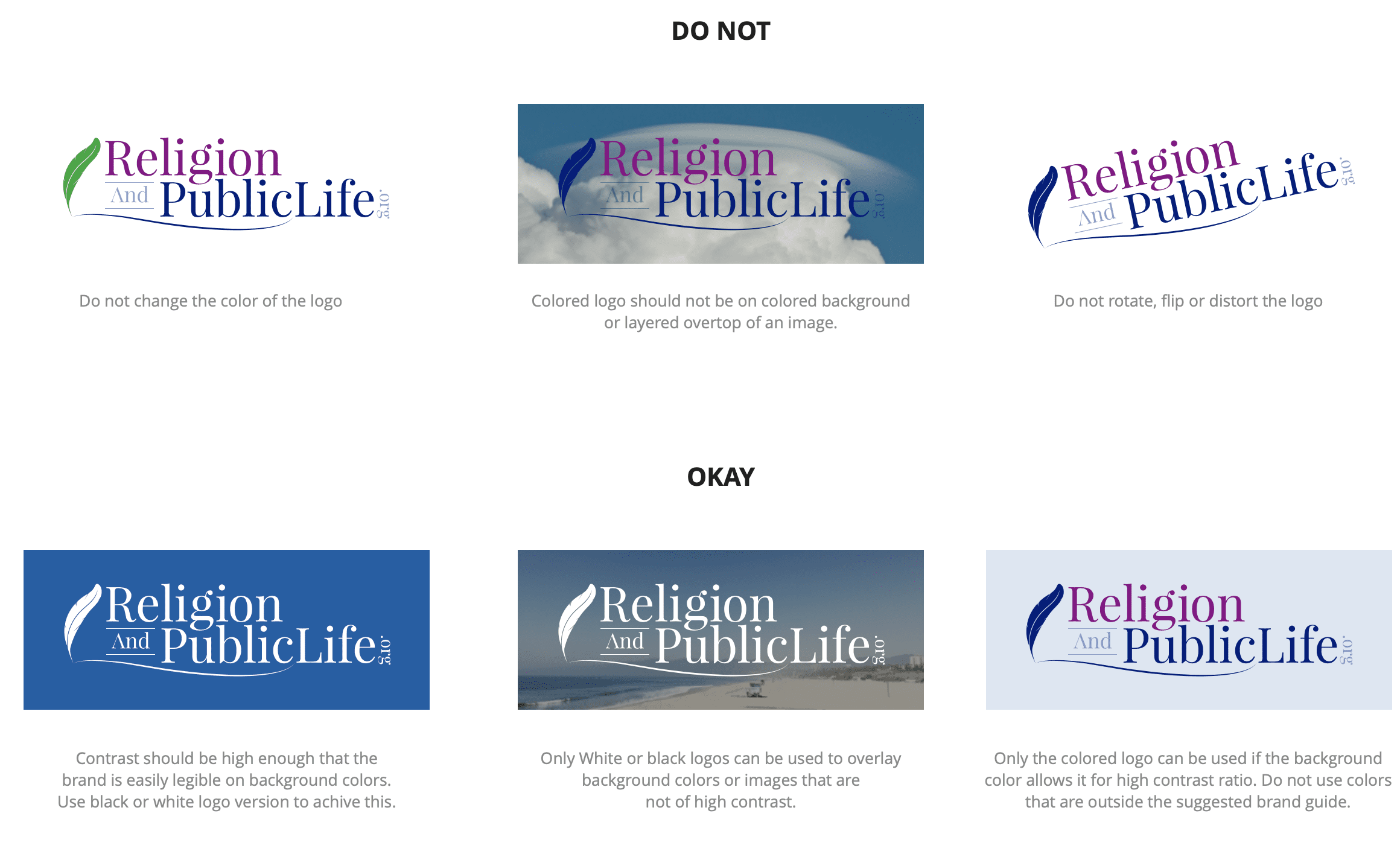
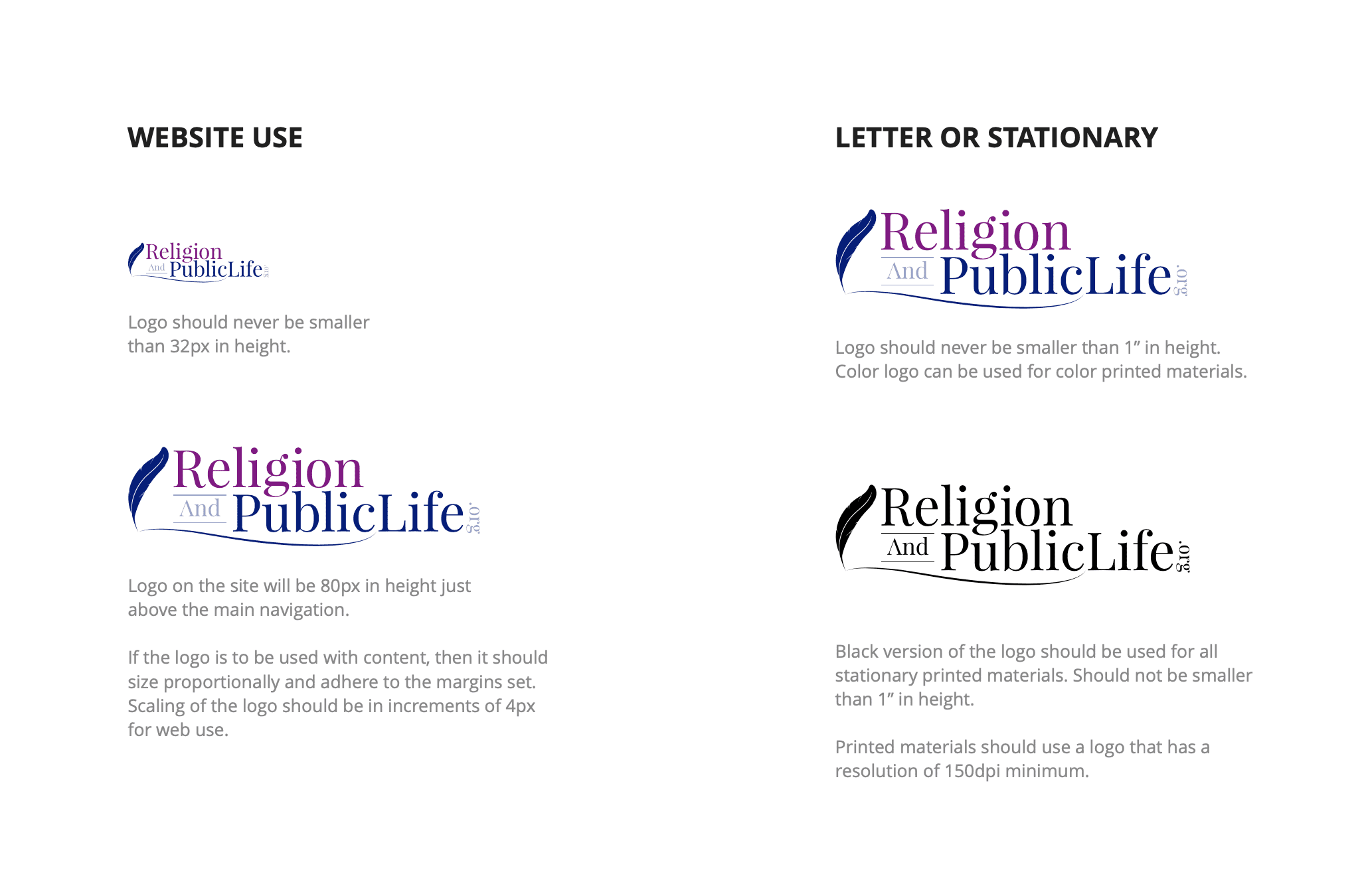
The logo should maintain a good margin allowing it to breath around other objects. Using the height of the R or P in the logo as an increment of X space around the logo. To achieve this using Elementor, add 30px padding around the image.
- Religion = Dark Magenta (#8C0087).
- Feather, stroke and PublicLife = Resolution Blue (#001C7D).
- And and .org = Resolution Blue (#001C7D) at 40% opacity.
- This will allow the logo to only use 2 colors for simplicity.
3. Icon
Icon 1. White Quill, blue-purple fade background
4. Colors

Resolution Blue (H1)
RGB 0,28,125
HEX #001C7D (100%)
HEX #001C7DCC (80%)
HEX #001C7D99 (60%)
HEX #001C7D66 (40%)
HEX #001C7D33 (20%)

Lapis Lazuli (H2)
RGB 4,94,167
HEX #045EA7 (100%)
HEX #045EA7CC (80%)
HEX #045EA799 (60%)
HEX #045EA766 (40%)
HEX #045EA733 (20%)

Dark Magenta (H3)
RGB 140,0,135
HEX #8C0087 (100%)
HEX #8C0087CC (80%)
HEX #8C008799 (60%)
HEX #8C008766 (40%)
HEX #8C008733 (20%)

(Block Background)
RGB 4,94,167
HEX #045EA733 (20%)

(Body Text)
RGB 68,68,68
HEX ##1C1D1E (100%)

Silver Metallic
(Captions)
RGB 169,172,178
HEX #A9ACB2 (100%)

(Button Background)
RGB 238,240,243
HEX #EEF0F3 (100%)

(Page Background)
RGB 250, 251,253
HEX #FAFBFD (100%)

(Text Box Background)
RGB 169,172,178
HEX #FFFFFF (100%)
5. Fonts
Headline 1
H1. Cardo Regular 28px 400 weight #001C72
Centered Page Titles (Resolution Blue)
Headline 2
H2. Cardo Regular 24px 400 weight #001C7D
Primary Section Header (Resolution Blue) followed by Page Separator (Resolution Blue)
Headline 3
H3. Cardo Regular 24px 400 weight#045EA7
Sub-Section Heading (Lapis Lazuli )
Headline 4
H4. Cardo Regular 24px 400 weight #8C0080
Sub-Sub-Section Heading (Dark Magenta)
Headline 5
H5. Cardo Regular 24px 400 weight #FFFFFF
Background Heading for Boxes (Resolution Blue or manually forced white text for dark backgrounds)
H6 Captions
H6. Lato 16.5px 300 weight #1c1d1e
Captions, footers, information bar
Body
- font-family: Lato
- color: #1C1D1E
- font-size: 16.5px
- font-weight: 400
- font-style: normal
Paragraph justified left with one space between paragraphs.
Body hyperlinks in Resolution Blue (#001C7D) and Lapis Lazuli (#045EA7) as the hover color.
Lorem ipsum dolor sit amet, consectetur adipiscing elit. Phasellus vel tempor felis. Cras varius vulputate ultrices. Ut vitae sample text in italics hendrerit auctor eget vitae nisi. Nunc congue, odio in laoreet ullamcorper, ipsum magna imperdiet erat, volutpat id quam.
Sample text that is hyperlinked tristique senectus et netus et sample text in bold. Praesent vestibulum nulla nulla, ut tempus ligula consequat ac. Duis ullamcorper quam felis, sollicitudin elementum eros maximus a. Etiam eget efficitur velit, dictum ipsum. Donec quam dolor, eleifend non ultricies, sollicitudin vitae arcu.
6. Boxes
Subsection headline H3
Subsection headline 30px
Subsection headline 30px
7. Profiles


Dr. Andrew Henry

Eleesha Tucker

SiouxSanna Ramirez-Cruz


